Block
Layout
The Fullstack theme offers over 100 features, distributed across more than 40 sections and over 60 blocks. All this, without compromising your brand's visual identity.
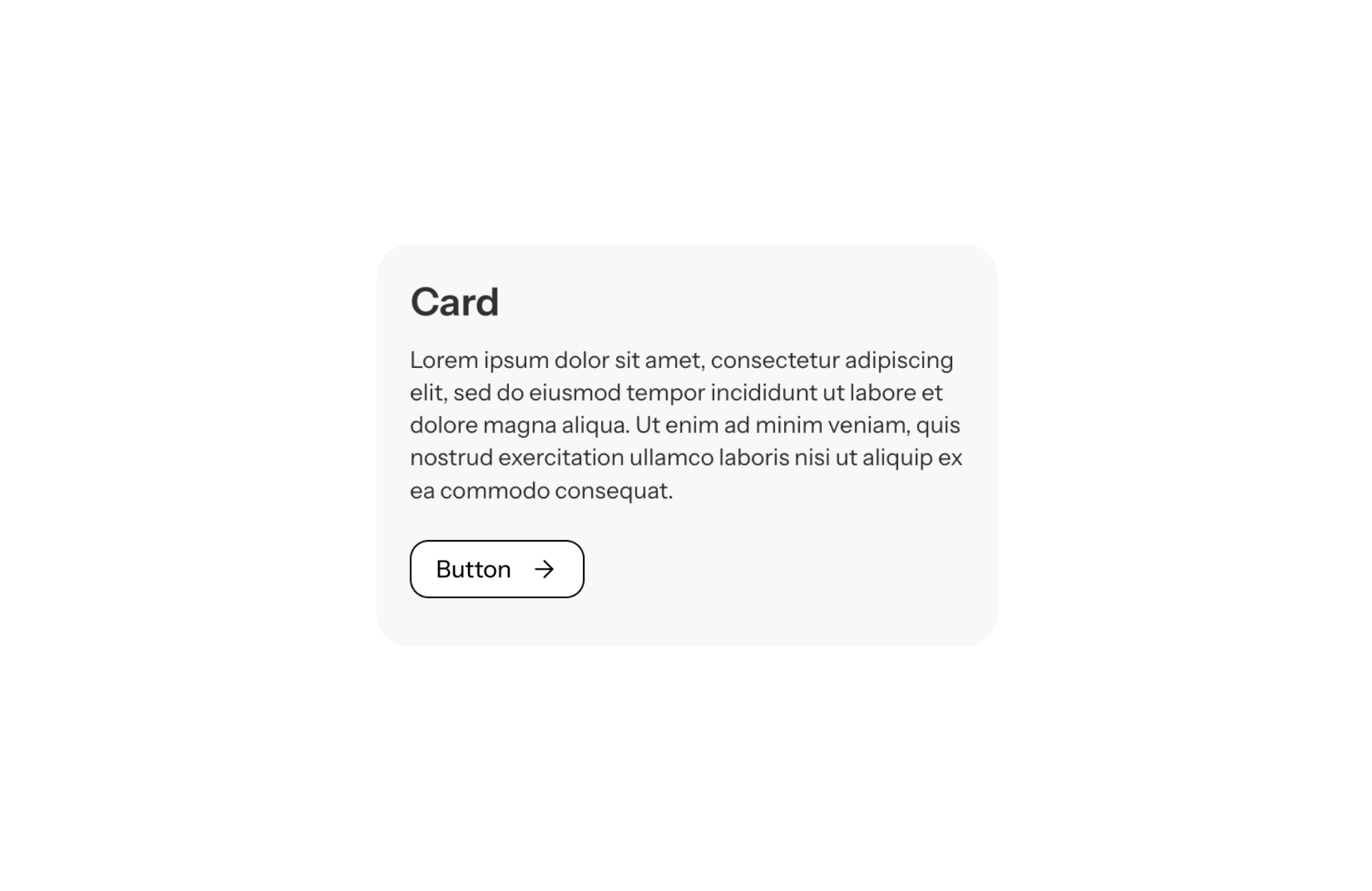
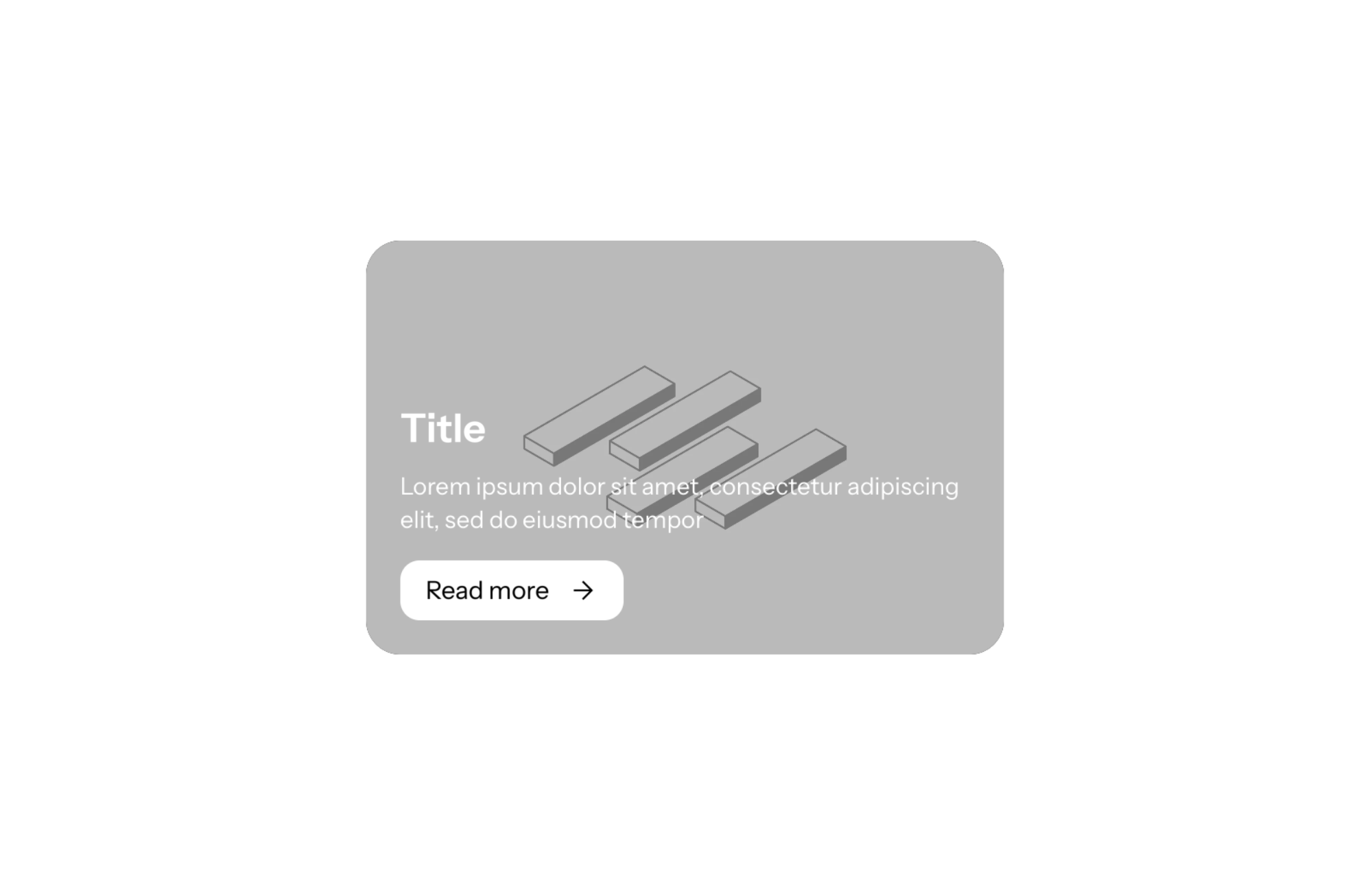
A Shopify theme with a “Card” block lets you group a heading, some text, buttons or icons inside a frame with its own background color and rounded corners. The card sets a piece of information apart from the rest of the page: help for customers, a selling point, an offer. In FullStack, it is the Group block with the card option turned on, usable anywhere theme blocks are accepted.
On a long page, everything quickly blends together. A card breaks the flow: the eye stops on that block and reads it as one unit. It works well for messages you want people to actually read, such as customer service hours, a guarantee or a perk.
Repeated in a grid, cards also organize content: three cards side by side read as three options or three arguments, much faster than a paragraph.
Cards also help on mobile, where sections stack into one long column. A framed block with a distinct background tells shoppers where one topic ends and the next begins, so key information like returns or support hours does not get lost while they scroll.
Add a Group block (or its Card preset) to a custom section, a banner or another group, then tick Wrap in a card (wrap_in_card). The card settings then appear:
Content is laid out with the group’s layout engine: flexible (direction, alignment, justification, wrapping) or a grid of 1 to 6 columns, with adjustable width and gap. The mobile settings unlock when you untick “same as desktop” (same_as_desktop). Inside the card you can place any theme block: text, button, icon with text, image.
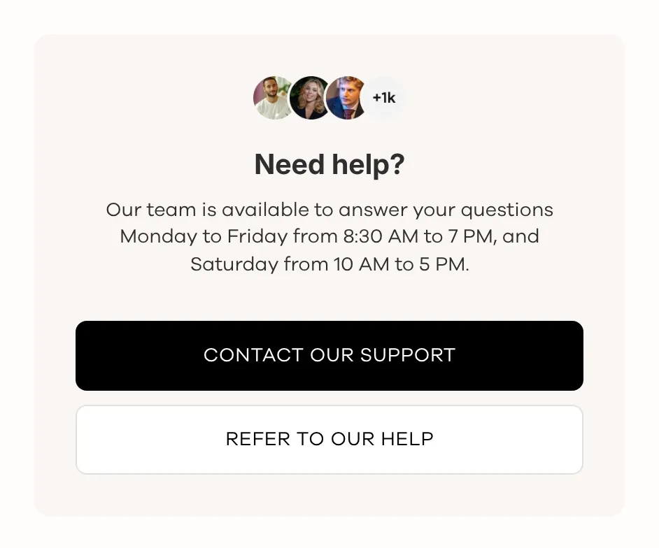
Just like the demo: a “Need help?” heading, customer service hours, then two full-width buttons to contact and FAQ. Use a color scheme slightly different from the page background.
A grid of three or four cards, each with an Icon with text block: free shipping, secure payment, returns. Border on, background matching the page, for a subtle look.
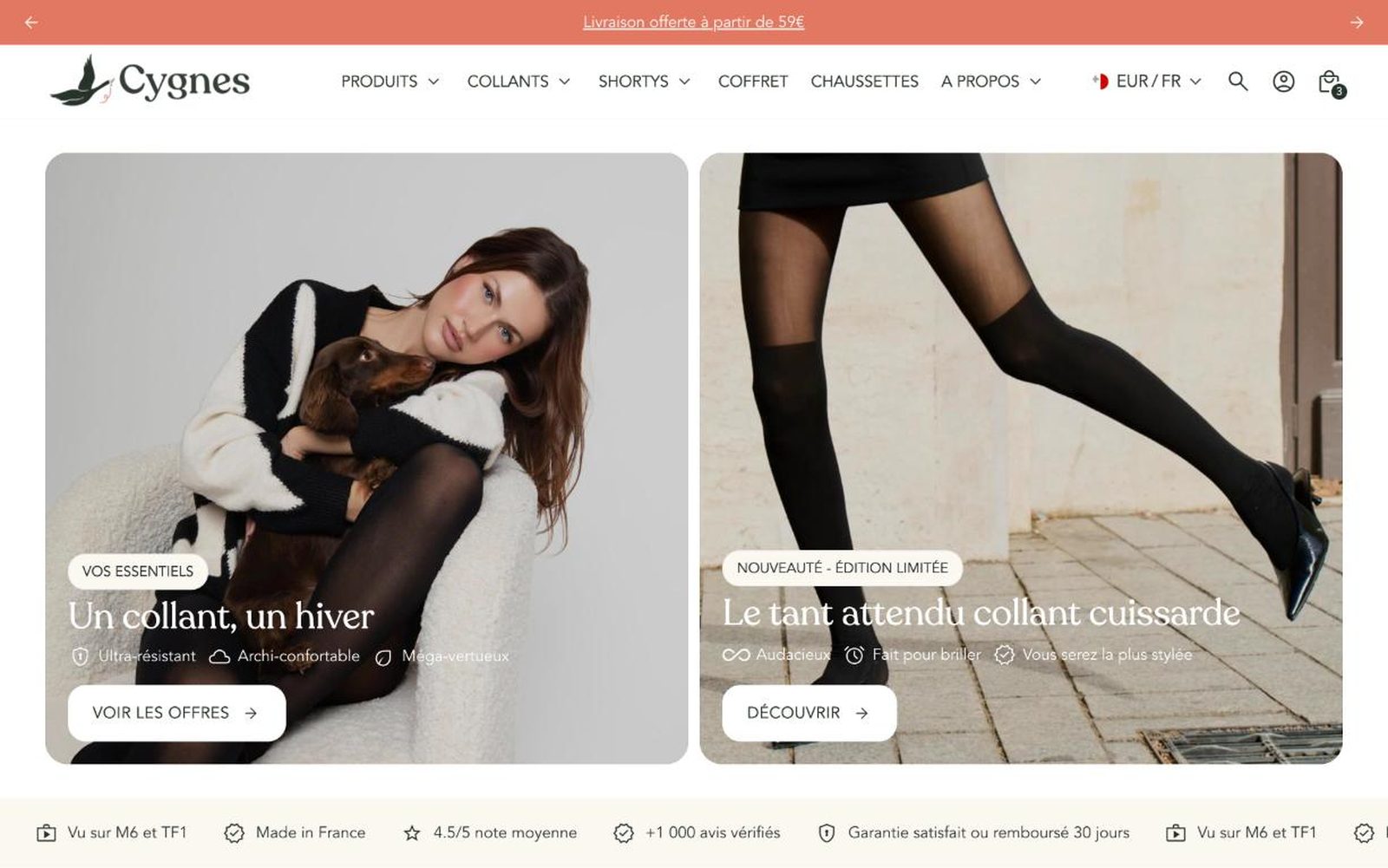
One card per hero product with a heading, a one-line promise and a card link (card_link) to the product page. In that case, skip the button inside: click areas would overlap.
The card has no background image: for a photo behind the content, use the Image card block. Nesting groups is powerful, but each level should stay simple or the page gets hard to maintain. The block is included in the license described on the pricing page.
It is a Group block with “Wrap in a card” (wrap_in_card) ticked, or you can insert its Card preset directly.
Yes, with the card_link setting. In that case, avoid buttons inside so two links do not overlap.
Yes: untick “same as desktop” (same_as_desktop) to set direction, columns, gap and width for mobile.
Rated 4.9/5 out of 200+ reviews



Rated 4.9/5 out of 200+ reviews