Block
Navigation
The Fullstack theme offers over 100 features, distributed across more than 40 sections and over 60 blocks. All this, without compromising your brand's visual identity.
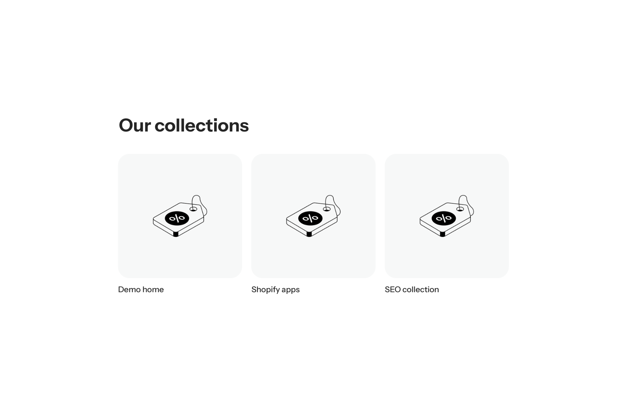
A Shopify theme with a collection list block lets you show collection cards (image and name) inside a layout, not just as a full-width section. In FullStack, this block is the twin of the Collection list section: same cards, in a grid or a slider, but placeable in a mega menu, the mobile menu, a tab or a group. It is visual navigation by category, right where shoppers look for it.
Shoppers who arrive without a clear idea need direction. A list of text links makes them read and guess what each category holds. Illustrated cards show the universe at a glance: they recognize what they like and click.
The catch with a section is that it takes a full-width band at a fixed spot on the page. Yet the moment shoppers try to find their way is often when they open the menu. The block puts those cards straight into the mega menu or the mobile menu, with no duplicate content to maintain.
The Collection list block (collections-featured) is a public block. It follows the same logic as the section of the same name:
Each card is rendered by the Collection card block, defined once for the whole list. Its children are an Image block and a Text block, fed automatically by the collection: its image and its title. You also set the card option (wrap_in_card) with its color scheme, and the spacing between image and text (layout_gap, 0 to 30 px, 10 px by default). There is no per-collection customization, which is exactly what keeps the cards consistent.
For a full-width collection list on the homepage, the Collection list section is still the right tool. And for cards with the name laid over the image, the theme offers presets built on image cards.
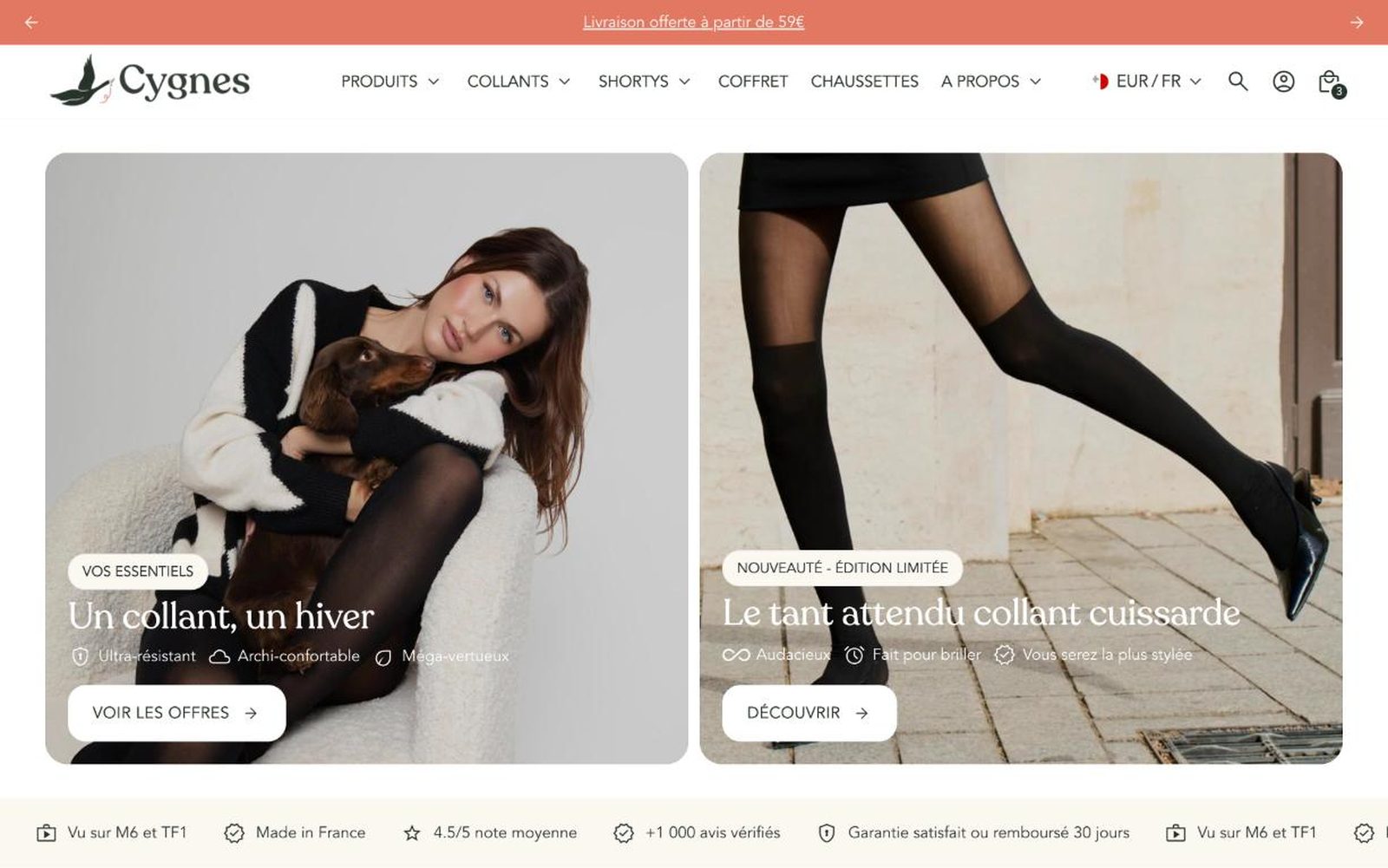
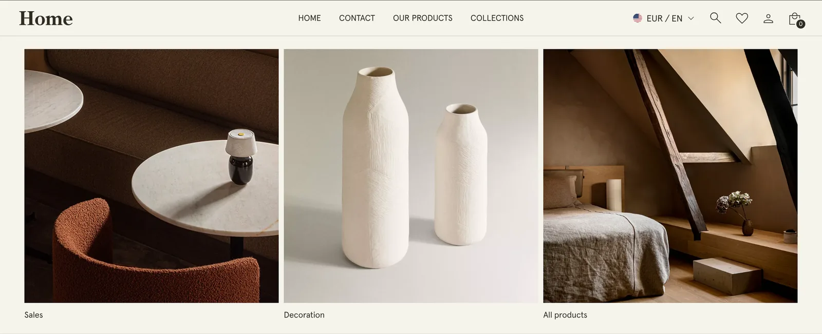
Three collections at most in the mega menu, in a grid, with lifestyle images framed consistently. Shoppers pick a universe without leaving the page. That is the Home demo setup.
A Tabs block with one tab per audience, each holding a collection list block as a slider (clothing, shoes, accessories). On mobile, the slider avoids a long column of cards.
Goal-based collections (sleep, energy, immunity) in the mega menu: the Supplement demo also uses this block in its mega menu. Shoppers who don’t know your products yet come in through their need.
The block shows collections, not their products: for a collection’s products, use the Featured collection block or section. All cards share one definition, so you can’t highlight a single one. Images come from your Shopify collections, and the card can’t fix mismatched visuals. The block is included in the theme, see the pricing page.
The cards are identical. The section takes a band of the page, the block fits inside a layout: mega menu, mobile menu, tab or group.
From the collection itself, in your Shopify admin. The card’s Image and Text blocks fill in automatically.
Yes, the Home demo does it in the drawer menu header.
Rated 4.9/5 out of 200+ reviews



Rated 4.9/5 out of 200+ reviews