Learn how shopify theme blocks fit into sections, which block types Shopify supports, and how to choose flexible layouts for your store.

Thomas GiraudLinkedIn
Co-founder of FullStack, founder of the CRO agency The Deployer

A product page is more than a title, photo, and button. The way you arrange those elements affects how clearly shoppers can find details, compare options, and take the next step. Shopify theme blocks give you smaller building pieces inside a section, so you can change its content and order without rebuilding the whole page. For example, a product information section might contain a heading, price, description, and purchase button. Our Shopify reassurance blocks offer one example of the kinds of supporting content merchants may want to place alongside product details.
Blocks aren’t a universal menu of interchangeable features. Your theme determines which blocks are available, which sections accept them, and whether you can nest one block inside another. Shopify’s documented limits also distinguish the total number of blocks a template can contain from the number allowed in an individual section, so the editor’s options and your theme’s structure both matter.
Think of a template as the structure for a page type, such as a product page. A section is a larger page area, such as the main product information or a collection banner. Blocks sit inside sections and control smaller elements, such as text, images, buttons, or product details.
In the theme editor, you can rearrange sections on a template and rearrange blocks within a section, as long as the theme allows it. Shopify’s Help Center describes a limit of 25 sections and 1,250 blocks across a template; the actual blocks available in each section depend on the theme. Those limits matter when planning a page with many content areas, but they don’t mean every section can use every block. See Shopify’s sections and blocks documentation for the platform’s explanation.
For example, a product page might use a product information section for the title, price, and purchase controls, followed by a separate section for a care guide. A care-guide section could contain a heading, an image, and several text blocks. Treating these as separate pieces makes it easier to change the content without changing the page’s overall structure.
The available choices depend on your theme, the section, and any installed apps. Common examples include heading, text, image, button, product information, and app blocks. Some sections use a limited set of blocks for a specific purpose, while others offer a broader selection.
Shopify distinguishes section blocks, which belong to a particular section, from theme blocks, which can be reused across compatible sections. App blocks come from installed apps and can add app-provided content or functionality in supported areas. Shopify’s developer documentation explains how theme blocks can also be nested when the theme and parent block support that structure. The key distinction is that a block’s name alone doesn’t tell you where it can be used; check the block picker and your theme’s documentation. Read Shopify’s block architecture overview for more technical detail.
Start by opening the theme editor and choosing the page template you want to change. Select a section in the editor sidebar, then use its block controls to add, remove, edit, or reorder the available elements. Preview the page as you work, especially if you’re changing the order of product information or adding content below the main product area.
Imagine adding a short fit note to a product page. If the product section offers a text block, add it near the size selector so shoppers see it where it’s useful. If that section doesn’t offer the block you need, check whether another section supports it or whether the theme provides a dedicated fit-guide option. The editor only exposes blocks supported by the selected theme and section.
Choose a block because it answers a shopper’s question or helps them complete a task, not simply because it is available. On a product page, a clear image, concise details, and a visible purchase control may be more useful than a long stack of unrelated content. On a collection page, product cards and sorting controls serve a different purpose. The right arrangement depends on what shoppers need at that point in their visit.
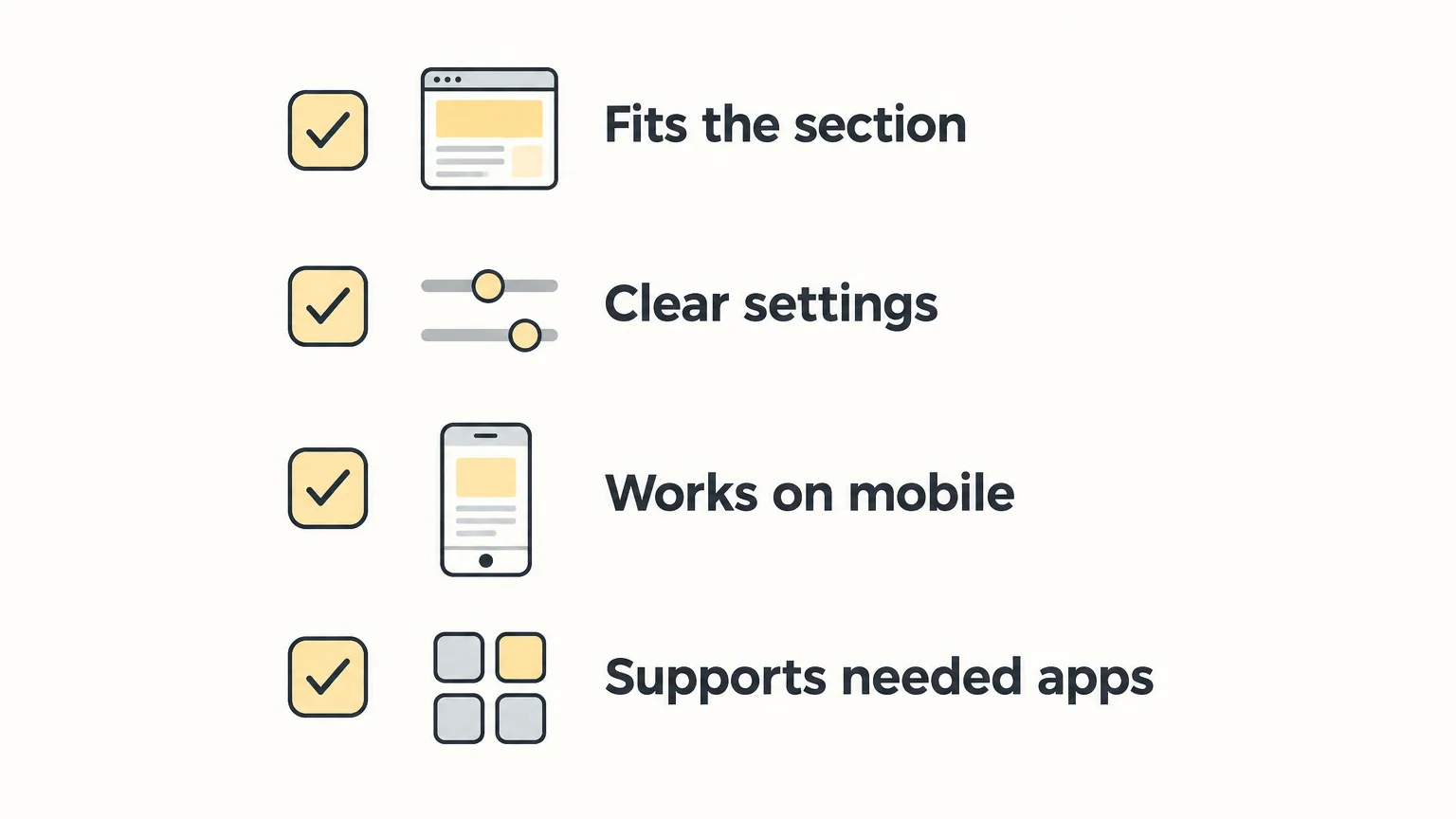
Consider how each block reads on a phone, where a long sequence of content can push key details farther down the page. Check whether settings are understandable, whether blocks can be reordered, and whether an app block is needed for a feature you already use. For technical teams, Shopify’s reference theme provides an example of how theme development structures reusable and section-specific blocks.
For product details, image, text, and icon blocks can help organize information into sections shoppers can scan. For example, a skincare store might use a product image alongside a short ingredient explanation, then place shipping and returns details nearby. A clothing store could use a fit note and size-guide link close to its size selector. Keep each piece focused, and make sure images and copy remain clear at mobile sizes.
Some themes include dedicated block types for these jobs. Our Shopify image blocks can support visual product details, while icon blocks with text are another way to present concise supporting information. For a clear next step, Shopify button blocks can be used where a call to action belongs. Which options are available depends on the theme and section.
Don’t judge a theme only by the number of blocks it lists. Check whether its blocks fit your store’s recurring needs, whether sections accept the blocks you expect to use, and whether the layout stays easy to edit. Too many tiny, overlapping controls can make a page harder to maintain; Shopify’s developer guidance also recommends keeping block structure useful and settings relevant to the block.
Before committing to a theme, test a representative page. Try moving a block, changing its settings, and previewing the result at mobile and desktop widths. If app content matters to your store, confirm that the relevant sections support app blocks. This practical check reveals whether the theme’s flexibility matches your actual workflow.
FullStack is one example of a theme that treats blocks as building pieces for page layouts. In version 2.5.0, the FullStack theme includes 100+ native features across 35 sections, 44 public blocks, and 60 private blocks. Its Group block supports flex or grid layouts, nested blocks, and 29 composition presets, giving merchants multiple ways to organize supported elements within a layout.
That structure is useful when you want to reshape a section rather than accept a fixed arrangement. It also makes a theme’s editing experience worth testing: look at how blocks are grouped, which settings are exposed, and whether the available structures suit your pages. The FullStack theme is built by the team behind The Deployer, a Shopify CRO agency with experience from more than 150 store redesigns and hundreds of A/B tests; the theme’s block layouts are one practical expression of that work, not a promise of a particular result.
Shopify theme blocks are the smaller, editable parts inside sections, while sections organize the larger areas of a page template. Before choosing a theme, test the block options on a real product or collection page, check how they behave on mobile, and make sure the available structures support the content your shoppers need. A focused set of useful blocks is easier to manage than a crowded editor.
When a theme’s block options match your store’s needs, you can organize useful content inside the Shopify editor instead of treating every layout change as a custom project. The FullStack theme brings sections, public and private blocks, and nested layouts together in one theme.
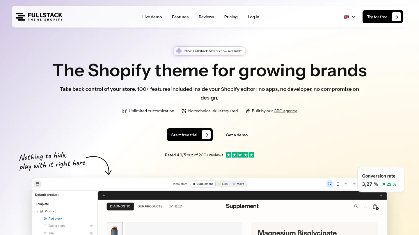
Explore Shopify theme features to see how FullStack’s sections and blocks are structured, including its Group block with flex or grid layouts, free nesting, and 29 composition presets.
A section is a larger page area, while blocks are the smaller elements placed inside it. A product information section, for example, might contain title, price, text, and button blocks.
Yes, if your theme provides the blocks you need, you can add and arrange them in the theme editor. If the option is unavailable in the selected section, check the theme documentation or ask the theme developer about supported alternatives.
Theme blocks can be reused across compatible sections when the theme supports them. Section blocks are tied to their specific section, and app blocks come from installed apps.
Some theme blocks support nesting, but the theme must allow it for the relevant block and section. Check the editor’s available controls and preview the resulting layout before publishing.
Version 2.5.0 of the FullStack theme includes 44 public blocks and 60 private blocks across 35 sections. Its Group block supports nested layouts and 29 composition presets.
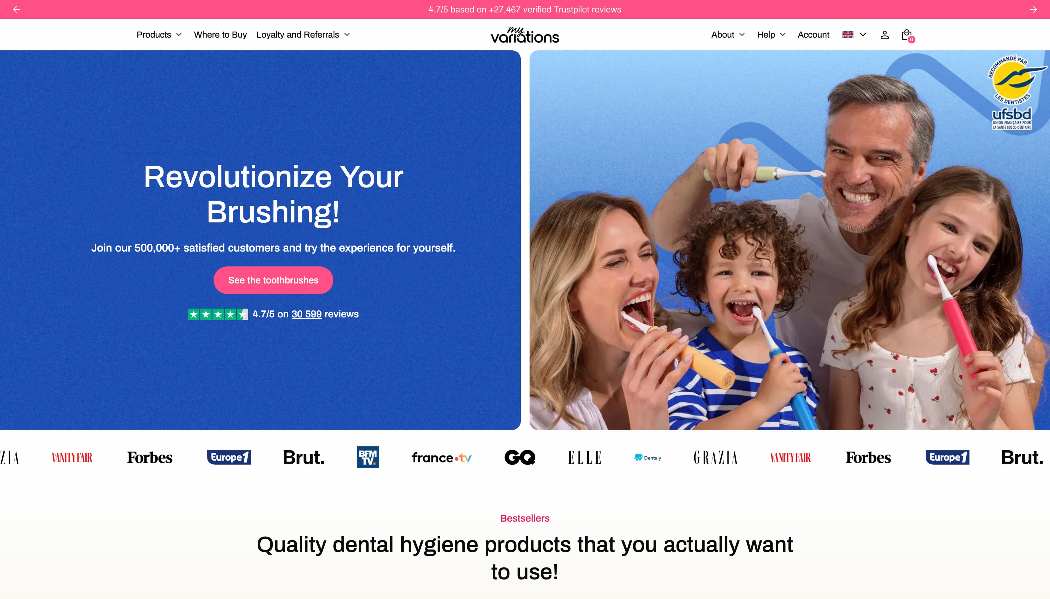
The oral care brand migrates to a technical foundation fully controlled in-house. Fewer apps, more velocity, and a storefront that finally matches the brand's image.
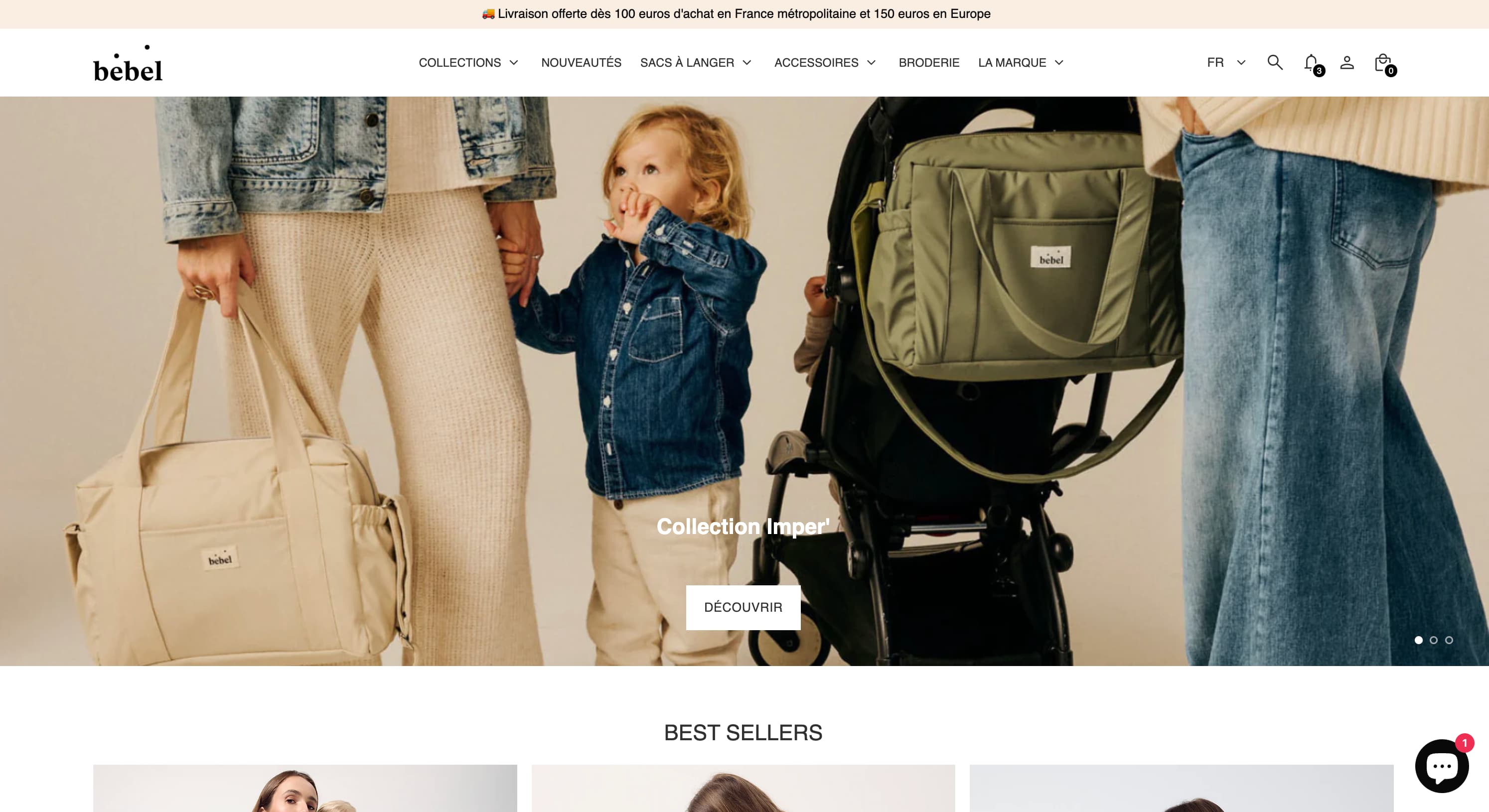
Changing bags, sleep sacks, Oeko-Tex double gauze — a like-for-like rebuild of the made-in-France baby care store on Theme FullStack, delivered by The Deployer.
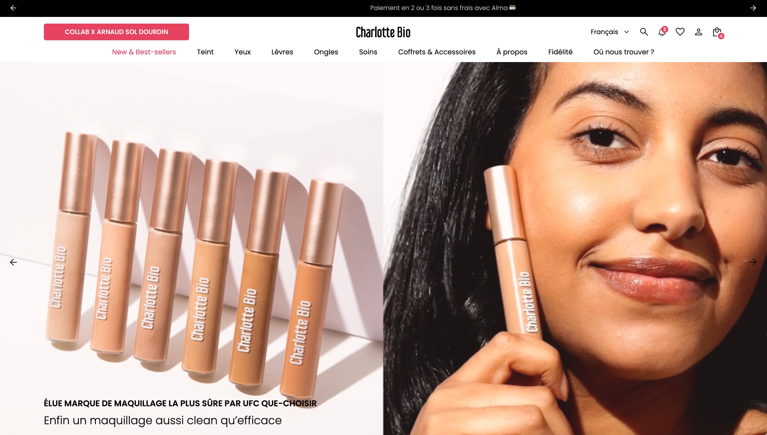
Visual mega menu, custom pack builder, FR/EN/ES internationalization, cart cross-sell — a full redesign on Theme FullStack executed by The Deployer.
Rated 4.9/5 out of 200+ reviews



Rated 4.9/5 out of 200+ reviews