
Feature
Layout
The Fullstack theme offers over 100 features, distributed across more than 40 sections and over 60 blocks. All this, without compromising your brand's visual identity.
Do you want a Shopify theme to hide items on desktop/mobile in order to optimize the user experience of your online store? This feature can greatly improve the navigation of your customers by adapting the content according to the device used. In this article, we will see together how the FullStack theme can help you achieve this goal.
In the world of e-commerce, offering a user experience optimal is essential for increasing sales. Users are increasingly browsing on various devices: desktops, tablets, smartphones. According to statistics, in 2024, more than 60% of online purchases were made through mobile devices. It is therefore crucial to adapt the content of your store according to the medium used.
Smartphone screens are smaller and touch navigation is different from using a mouse on a desktop computer. Hiding certain elements on desktop or mobile makes it possible to optimize the loading of pages and to display only the content that is relevant to the user. For example, a high-resolution image might be great on desktop, but slow the site down on mobile. Likewise, a complex menu can be simplified on mobile to facilitate navigation. By adjusting the content, you improve the performance of your online store while meeting user expectations.
In addition, Google takes mobile performance into account in its SEO algorithm. A mobile-optimized site is more likely to appear at the top of the search results, increasing organic traffic to your store.
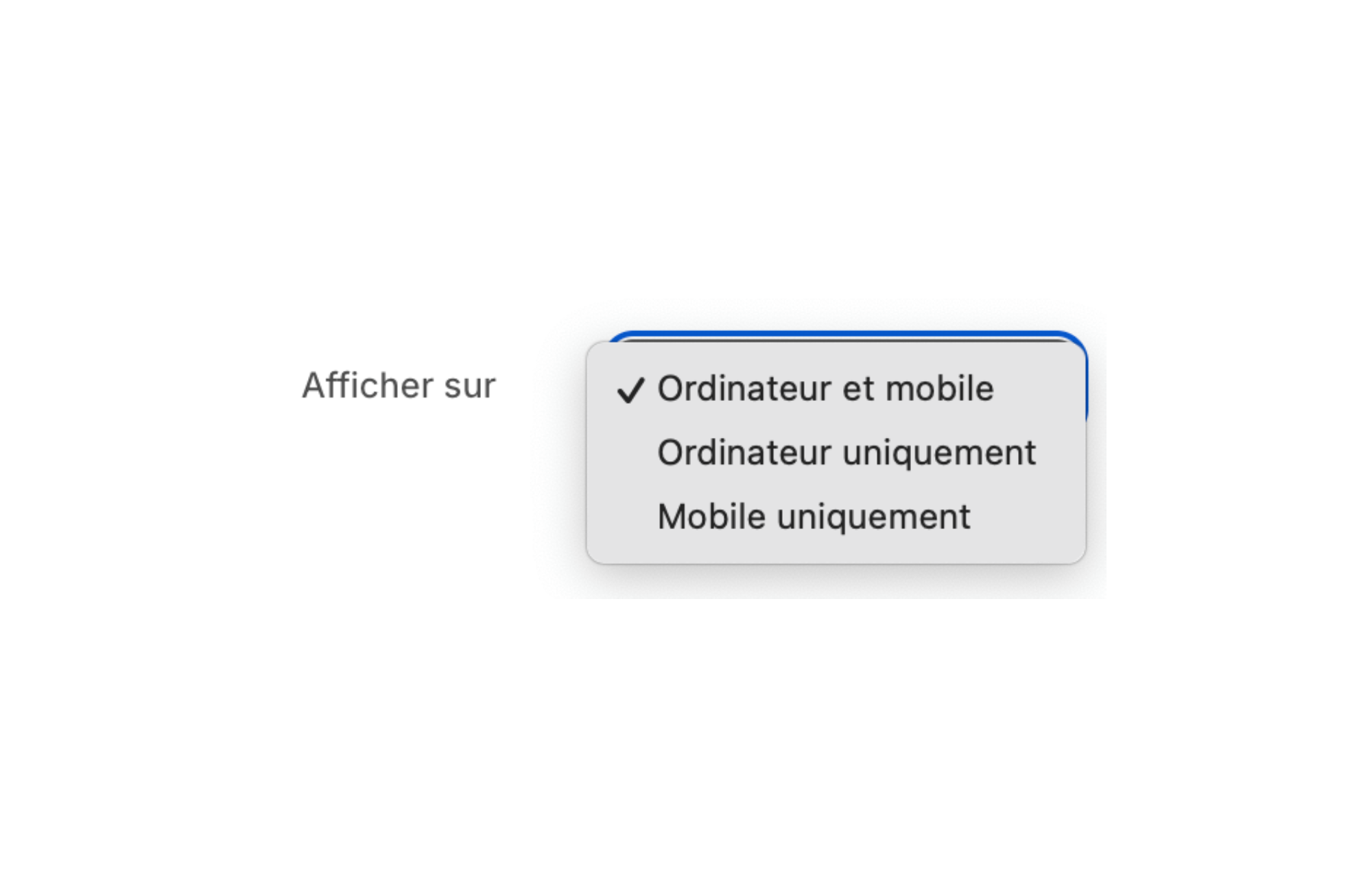
The adaptable Shopify theme FullStack integrates a powerful feature that allows you to hide specific elements depending on the device used by the visitor. With this customization feature, you can precisely control what's displayed on desktop and mobile, without the need for coding skills or installing expensive third-party applications.
This feature can be accessed directly from the Shopify theme editor. It allows you to define visibility rules for each section, block, or element of your site. For example, you can choose to show a slideshow of images only on desktop, or to highlight specific promotions on mobile.
FullStack is designed to be modular and efficient. By reducing the number of items loaded on each device, you not only improve the user experience, but also the speed of your site, which is a key factor in search engine optimization (SEO).
Using this feature is easy and intuitive. Here is a step-by-step guide to help you implement this feature in FullStack:
In a few minutes, you can customize your site to perfectly meet the needs of your customers, regardless of the device used. This feature gives you great flexibility without requiring you to change the code of your site.
By exploiting the element cache feature on desktop/mobile of the FullStack theme, e-retailers benefit from numerous advantages. Not only are you providing a better user experience, but you are also optimizing the performance of your site, which can have a direct impact on the conversion rate.
Here are some key benefits:
According to a study, 88% of online consumers are less likely to return to a site after a poor user experience. By optimizing your site with FullStack, you increase customer satisfaction, which can translate into a 25% increase in sales over a year.
By adapting the content of your site according to the device, you create a personalized experience for your visitors. This may include simplifying the menu on mobile, highlighting certain products, or removing cumbersome items on small screens.
This personalization improves navigation, making customers more likely to stay on your site longer. According to a 2023 study, sites offering a personalized experience saw their engagement rate increase by 20%. An engaged customer is more likely to become loyal and to recommend your store to those around them.
By improving the performance of your site through the item cache feature, you can see a significant increase in the conversion rate. By eliminating unnecessary items on mobile, you make the buying process easier, which can lead to an increase in sales of 15% on average.
In addition, a fast and well-optimized site reduces the bounce rate. Internet users are impatient: 53% of mobile users abandon a page that takes more than 3 seconds to load. By using FullStack to optimize your site, you retain more visitors.
Using third-party applications to personalize your store can result in high costs and add weight to your site. With FullStack, you have over 40 built-in features, including the ability to hide items on desktop or mobile. This allows you to save up to 200 euros per month in app subscription fees.
By reducing the number of applications, you also improve the performance of your site. Each application added can increase the load time of your page by 0.1 to 0.5 seconds, which can negatively affect the user experience.
In short, use a Shopify theme to hide items on desktop/mobile like FullStack offers numerous advantages to e-retailers who want to optimize their store. This feature improves the user experience, increases conversion rates, and reduces costs associated with third-party applications. By adapting the content of your site to each type of device, you meet the expectations of your customers and stand out from the competition.
The FullStack theme, with its more than 40 features oriented to conversion and SEO optimization, is an indispensable tool to maximize your online profits. In 2025, staying competitive in the e-commerce market requires the adoption of innovative and efficient solutions such as FullStack.
Rated 4.9/5 out of 200+ reviews


.svg)
.svg)